- Intro
- Brief
- Highlights
- User-friendly design
- Outcome
Intro
Over time, the brand has grown into a recognized name among professionals, while still staying relevant for everyday and outdoor use. As it evolved, the existing website no longer matched that level, neither in user experience nor in how the brand was presented.
Brief
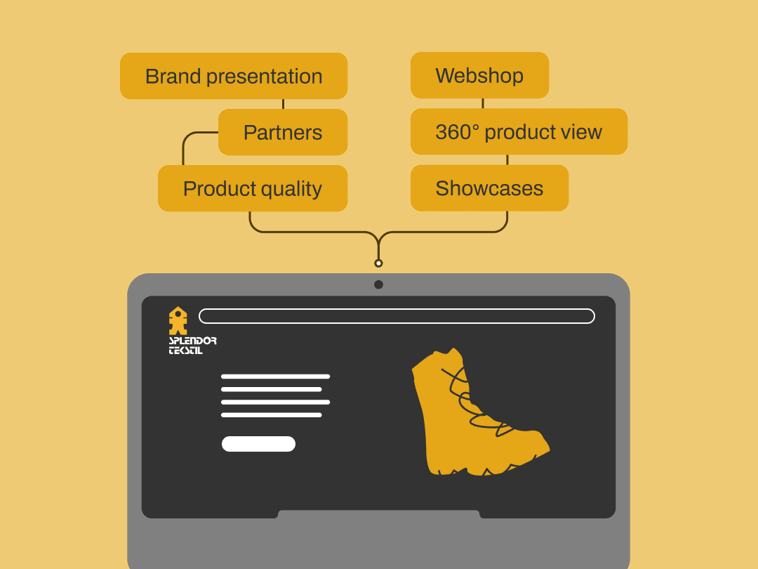
Evolved brand presentation
The goal was to develop a website that combines strong brand presentation with a fully functional webshop.
The focus wasn’t on changing the identity, but on presenting it in a way that feels modern, clear, and easy to navigate. The platform needed to communicate what the brand stands for: reliable, high-quality footwear built for demanding conditions; while making the full product range simple to explore and purchase.
Highlights
Evolved brand presentation
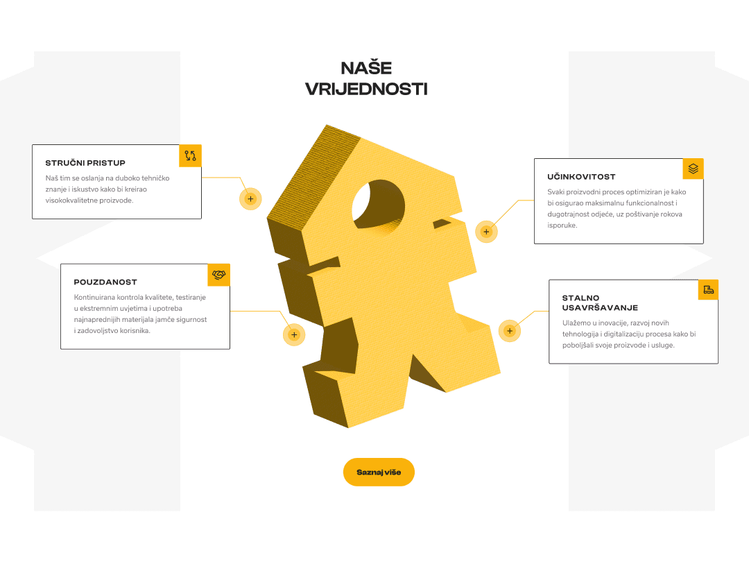
The existing branding was preserved but structured in a way that better reflects the brand today, with a stronger focus on expertise, durability, and real-life use cases.
Product-first experience
Instead of simply displaying products, the website showcases them. Technology, materials, and purpose are integrated into the browsing experience to support better customer decision-making.
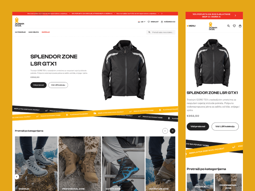
Clean and intuitive webshop
The webshop is designed as a simple, user-friendly interface where users can explore products through featured items, categories, or filters based on their needs and preferences.
360° product view
Each product includes a full 360° view, allowing users to examine details and get a better sense of the product before making a decision.
Built for professional users
Since a large part of the audience uses the footwear for work, the webshop includes permanent discounts tailored for professional users.
Multilingual structure
The website is available in both Croatian and English, making it accessible to local and international audiences.
User-Friendly Design Approach
Through audience research, we identified the most relevant categories based on user needs, professions, and browsing behavior. We also introduced subtle interactions, such as hover states and micro-animations, to provide feedback and make the experience feel more responsive without distracting from the content.
The UI remains clean and focused, with carefully considered typography and spacing to improve readability and make product information easy to scan. The entire experience is fully responsive, ensuring consistent usability across desktop and mobile devices.
Outcome
The user-friendly design significantly improved how visitors interact with the site, reducing effort and creating a more natural flow between browsing and buying.
Overall, the platform now reflects the level of quality the brand has always delivered, just in a way that users can instantly recognize.
